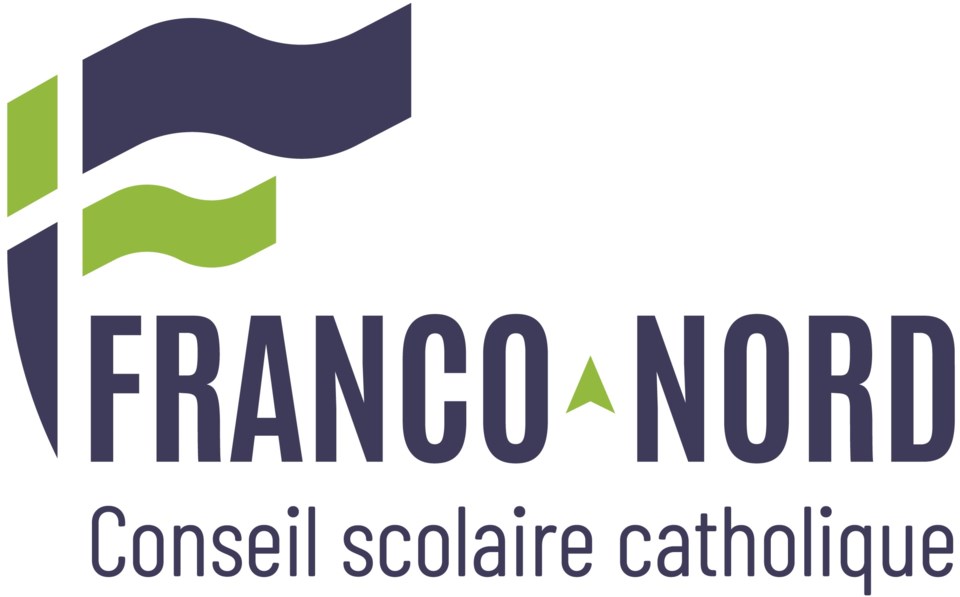
The Conseil scolaire catholique Franco-Nord (CSCFN) has unveiled its new brand image and a new strategic plan, which sets objectives and guides actions for the next five years.
"It is the result of numerous consultations with students, parents and staff members on various projects. All the comments received fuelled our reflections and guided us in the creation of this visual identity which captures the essence of our community," says a news release.
“Our refreshed, welcoming, dynamic and accessible image is faithful to the mission of offering French-language Catholic education as well as to our regional membership,” explains Serge Levac, director of education. “It is simple, easy to understand, adaptable and modern. It respects our rich heritage and allows us to promote children’s education.”
New Colours
The colour blue offers a violet hue; blue is inspired by the region's waterways. Violet is a liturgical colour that can also evoke creativity and reflection. The colour inspires confidence, professionalism and a balance between tradition and innovation. In addition to adding a nice touch of contrast, green is a reminder of the colours of Ontario's Francophonie.
New Logo
The logo's structure communicates hope and commitment to Catholic education. The curved stem at the bottom of the symbol guides the eye towards the name. It also brings a circular fluidity to the design that gives us a sense of unity, openness, trust, strength, and growth. The modern typography ensures legibility and projects an accessible image.
The graphic elements recall both flames or leaves and flags, symbolizing the Holy Spirit, the life and vitality of our Franco-Ontarian community, and the sense of movement and progress.
The arrow, acting as the hyphen, adds an element symbolizing the North and creates an upward movement signifying growth. The upward movement suggested by the typography and graphic forms symbolizes the quest for spiritual and intellectual growth, a core aspiration of Catholic education.
New Slogan
Growing means changing, transforming, moving, discovering, learning. The slogan “Faire grandir le monde” loosely translates to “Growing the World” and encompasses the commitment to educate, inspire and empower Franco-Nord students to become responsible citizens, believers who live their faith, enlightened leaders and active, contributing members of society.
“Our new vision is a call to action and a commitment to a better future for our students, our community, and the world. It articulates our collective aspiration to have a positive impact on the world around us” says Ronald Demers, CSCFN Chair. “Our new mission is our commitment to educate, inspire and empower our students to become responsible citizens, enlightened leaders, and active members of society.”
