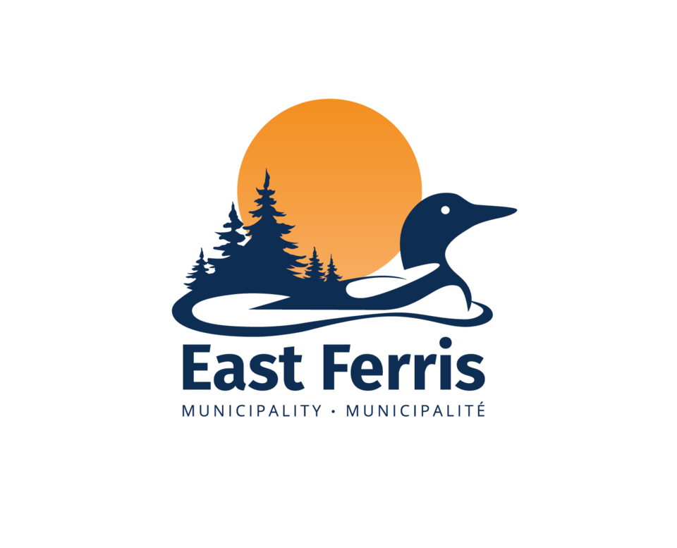
East Ferris has unveiled a redesigned website and logo to reflect the priority of communication voiced during its strategic planning process. It also coincides with the lead up to the township's 2021 centennial celebration.
The logo redesign started with a contest among Canadore College’s graphic design students and was finalized by a marketing firm. The township’s official seal served as the East Ferris logo for decades.
“The loon symbolizes tranquility and nature, which is abundant throughout the region, and its presence is a strong indicator of lake health,” states a media release. “The loon has been placed in a forward motion to capture the idea of progressive leadership.
“The forest-scape silhouette represents nature, strength, peace, abundance, and also serves to embrace the rising sun. The sunrise symbolizes growth and opportunity.
“The logo combines the elements in a representation of the municipality … The circle symbolizes a strong community. Nature, abundance and tranquility surrounds the positive, welcoming community; a community filled with a deep appreciation of their environment; a community led by progressive leadership.”
The redeveloped website, the primary communication tool for the township, involves the same branding goals with the practical need to make information readily available. The layout was modernized, some content is being reassessed and new content will be added in the coming months. Enhancements included improved search function, simplified organization, updated business directory, a reporting tool for concerns and service requests, as well as serving as a repository of municipal plans, studies and policies. See the official description of the logo and website changes HERE.
“In the near future, East Ferris will endeavour to enhance the website and modernize service delivery by enabling residents to access numerous services online,” the media release states.
